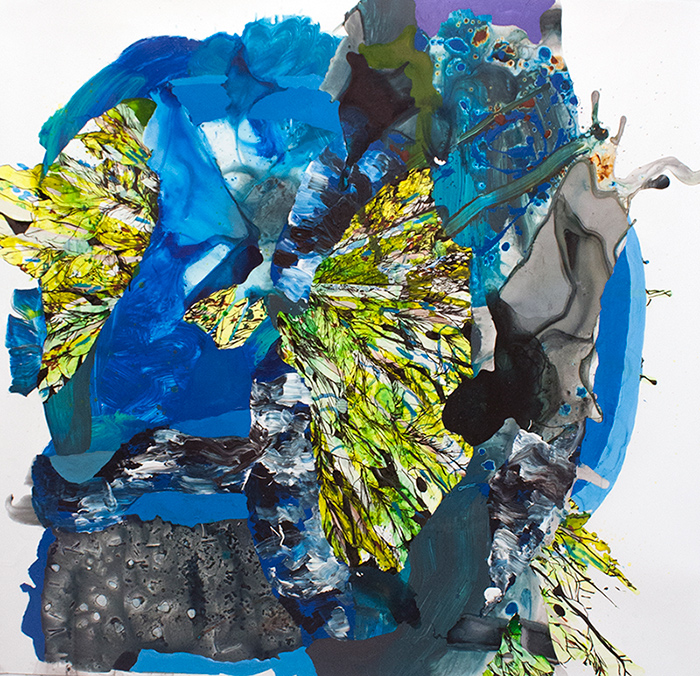
I am daily amazed by the talent I find in my foraging each day. But occasionally, I see one painting by an artist, think “oh that’s nice!”, then go to their website to be completely blown away. The work of Spanish-born New York based artist Pepa Prieto astounded me with her visual movement, texture and lively sense of composition. I can’t get enough!
There is so much going on, so many corners and nooks to explore in each piece, each one is like a virtual fun house and I want to get lost in them all! The artist paints these pieces intuitively, evoking a particular memory or moment in time, “a detailed snapshot of my inner dialogue”. What a beautiful conversation she is having.
To see more of Pepa Prieto‘s work, and you know you want to, please visit her website. Happy weekend, Artsies! What are you up to? We’ll be checking out Eureka’s local ArtWalk on Saturday, excited to share my finds with you next week!
Like many women of my generation, I somehow missed An Affair to Remember until Meg Ryan brought it to my attention. It was beautiful, witty, romantic and sappy, just like a great chick flick is supposed to be. And Deborah Kerr’s Terry McKay was completely captivating and one of the first iconic female characters I thought of when beginning the Feminine Wiles series.
With her warm auburn locks and creamy complexion, the film’s wardrobe designer Charles Le Maire wisely capitalized on her natural palette by using autumnal peaches and oranges in her costumes peppered throughout the movie.
Deborah Kerr as Terry McKay in An Affair to Remember, acrylic on canvas panel, 6×6
The character is smart and sassy, beautiful but down to earth and practical. Characteristics perfectly portrayed with a warm, simmering palette.
I have no idea how many of these I’ll do, but am thinking of broadening soon into more contemporary film characters– maybe even by decade? Um, hello, Molly Ringwald anyone? To see more paintings in the Feminine Wiles series, check the archives here.
Film image linked above, art by Lesley Frenz aka Artsy Forager.
We are more than the color of our skin. Who we are inside and what we do are so much more, yet we’re often instantly judged on this one small detail. In his current series, Puerto Rican born artist Edgar Sanchez Cumbas explores in paint and mixed media the idea of discrimination based on skin color.
We often begin our lives being teased for what makes us different– maybe our skin is pale thanks to a Celtic heritage or perhaps we’re on the other end of the flesh color spectrum and feel excluded due to a complexion much darker than our contemporaries. Instead of embracing the beauty in our diversity, in our longing to belong we ostracize. We lose the ability to see not just see beyond color but to see all color as equal and equally beautiful.
Sanchez Cumbas explores these ideas through his sculptural paintings, the artist builds up thick layers of color and texture, which are then obscured by a large swath of color. Only small hints at the layers beneath remain visible.
While I have a great love of work with lush, chaotic patterns and texture, there is always something so lovely and intriguing in work that embraces visual economy. Barcelona based, German born artist Sabine Finkenauer breaks down the world into simple lines and shapes, creating a signature visual language that is a little whimsical, a little retro and altogether lovely.
There is a childlike playfulness to her work, but her use of space and palette bring a sense of sophistication. Light-hearted enough to seem like Sunday afternoon doodles, looking closer and at her body of work as a whole, you can see the thought and calculation as she works her way through her use of space, line and color in drawing, painting, collage and sculpture.
Want to see more of Sabine Finkenauer‘s work? Please visit her website. Wouldn’t it be lovely to see the world in such a simple way? I’m making that a goal this week– ignore the distractions and see what is simply before me.
Another week, another painting in my Feminine Wiles series to share with you! Feminine Wiles is a series of small abstract color studies based on iconic female film characters. My introduction to many of these films and characters came through my mom, with whom I share a love of sappy love stories, witty characters, and gorgeous design. One of her favorite character turns ( and mine!! ) is Barbara Streisand as Fanny Brice in Funny Girl.
I’ve always loved the palette of this film– filled with warm earthy browns and oranges, highlighted with delicate pinks and passionate reds– but when thinking about this project, I was struck by the reoccurring use of lavender hues on and around Fanny. Of course, this could have something to do with how the cool hues so beautifully compliment Streisand’s creamy complexion! But I like to think that costume designer Irene Sharaff and the production team were delicately clueing the audience in to the fact that the character of this young girl from Henry Street was destined for greatness.
Barbra Streisand as Fanny Brice in Funny Girl by Lesley Frenz
acrylic on canvas panel, 6×6
Purples hues are often associated with royalty, riches and power. So it isn’t surprising that Fanny would often assume a lavender glow. She was a star, but unlike Jo Stockton, one of her own making. She was confident in her talent and passionate in her pursuit of fame and stardom, even at personal loss.
In the end, despite setbacks and heartache, Fanny perseveres and shows that the strong will always survive. I’ve always thought there were great lessons to be learnt from Funny Girl— of tenacity, talent, love, humility and perseverance. Oh and let’s not forget that unbelievably beautiful voice!
To see more from the Feminine Wiles series, check out the archives here. Next week, a polarizing character and one of the most iconic! Hint: drapery.
Film image sources linked above, art images by Lesley Frenz.
As many artists know, much of the time, art making is a matter of knowing when enough is enough. Or even when enough is just a bit too much. In her work, New York artist Miya Ando is creating pure moments of simply just enough.
By working in a process in which she hand-dyes metallic surfaces, Ando creates pieces with an incredible sense of stillness and light. Translucent layers of color reflect not just the light without but the light within. By keeping the compositions simple, the work is free from distraction, allowing the viewer to fall into its spell, to meditate on the purity of color and transformative power of light.
We all seem to seek peace and quiet. An escape from the chaos. And yes, its true, we do need those times of rest and rejuvenation. But sometimes it is in the chaos that we find our strengths, what we are really made of, that hone what we are all about. The abstract works of Washington, DC artist Katherine Mann are incredible clashes of material run wild and moments of fastidious control.
Each piece begins with a spill of color, an organic beginning to work that shifts between careful discipline and perceived pandemonium. They almost have a feeling of accidental abandonment, as if a pot of paint was spilled over a meticulously wrought drawing. I say almost because you can see that each is a mastery of composition– every placement of line, color and shape providing just the right compliment and contrast.
To see more of Katherine Mann‘s work, please visit her website. PS– I posted larger images than I normally do for artist features because these are human-scaled works– check out that last installation image for scale! Amazing.
I admit, I’m a big fan of the candy color confections of the film variety that came out of the 1950s and 60s. The costumes! The dancing! I love it all. One of my favorites of these sweet treats is Funny Face, starring Fred Astaire and Audrey Hepburn.
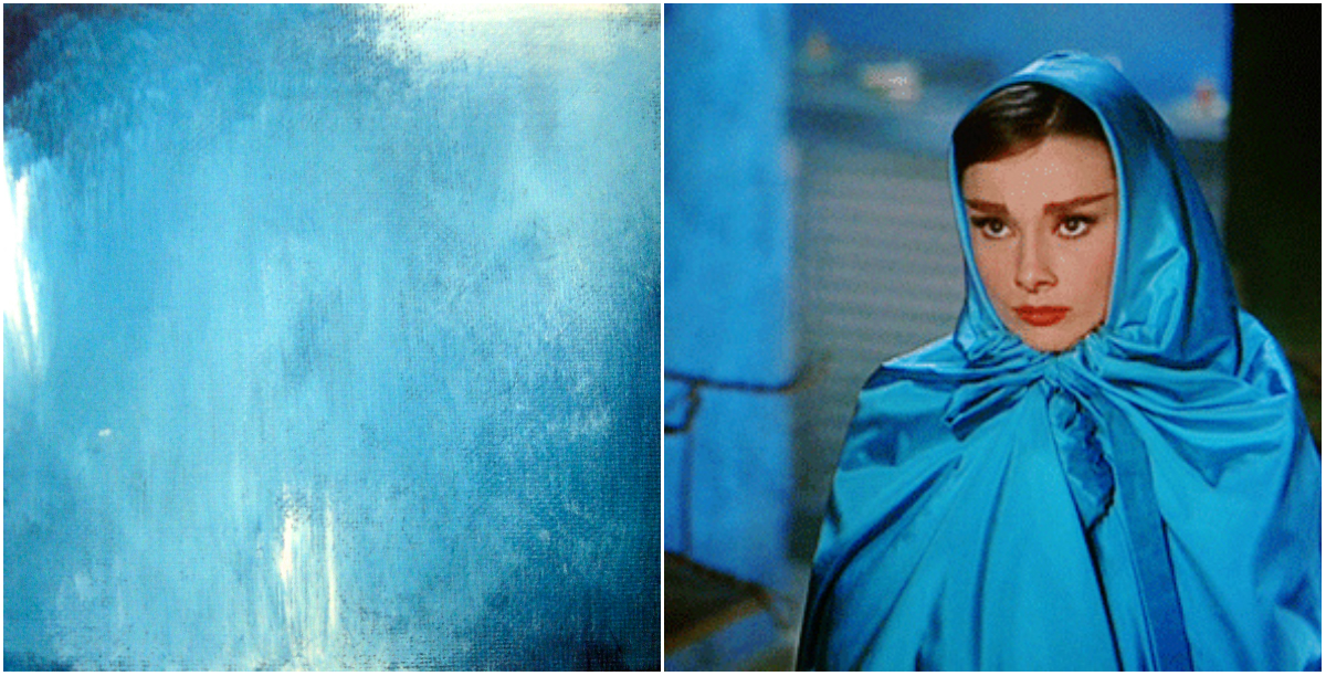
For the third painting in my Feminine Wilesseries, I wanted to capture the glamour and struggle of Jo’s transformation in Funny Face. Intellectual and bookish Jo finds herself thrown into the world of modeling and couture fashion, finding herself struggling with reconciling her newfound feminine allure and her high minded beliefs. I love that the character doesn’t allow her physical transformation to change her ideals.
In the scenes in which she wears this blue satin cape, the character is distressed over what she sees as insurmountable differences of mind between herself and the man she’s falling for, photographer Dick Avery played by Astaire. The color is such an intense, moody blue, with hints of grey and lavender, I’ve always felt like it captured the conflict inside her character beautifully.
Audrey Hepburn as Jo Stockton, Funny Face, The Blue Cape by Lesley Frenz
acrylic on canvas panel, 6×6
What do you think of this one, Artsies? I wish my camera could do these little paintings justice. Any sources/tips for photographing paintings using a point & shoot digital camera? Would love a DSLR but don’t see it in the budget any time soon! If you have tips to share, please let me know in the comments!
You can find more of the Feminine Wiles series here. I’ll have a new one for you next week, one of my favorite all time characters!
Film images linked above. Paintings by Lesley Frenz.
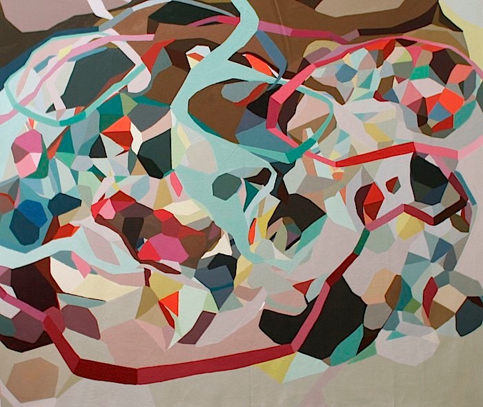
While we are getting settled into our new temporary Eureka home, what we want in our eventual forever home is heavy on our minds. While Mr. F aka Mr. Practicality is thinking of square footage, alternative power sources and cost, I tend to focus more on how the space will feel and how we will live in it. A home that is a peaceful retreat, yet full of life and creative energy. The mix of warm neutrals, light pales and bright shots of color in Untitled by this month’s Featured ArtistErin McIntosh, feels like the best of artsy spaces– inviting, yummy colors and patterns and spots of cool serenity.
Now to design a space how this painting feels– this interior featured on Apartment Therapy feels like the perfect translation. Though this series by Erin is based in geometric shapes, the atmosphere remains organic and flowing, never hard and stagnant. There is warmth to be found in the natural woods and nubby textures in the room and the pattern on the rug & other textiles calls out to the geometrics in Erin’s painting. My favorite element, the light blue concrete floor, provides a stream of lightness and translucency, just as shots of the same blue do in Untitled. Oh how an Artsy could live here!
To see more of Erin McIntosh‘s work, please visit her website! Want to see more from the Live the Artsy series? Check out the archives!
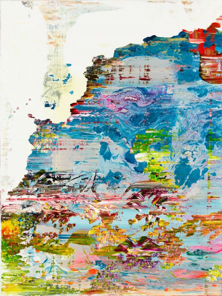
I’m a touchy feely person. As in I love running my hands over interesting textures. I’m that shopper who touches everything, I run my hands over tree bark and moss when we’re hiking and I have to force myself to refrain from touching artwork anytime I’m in a gallery or museum. So it kind of goes without saying that I love paintings with lots of yummy texture. The work of British artist Jessica Zoob is fairly oozing with lovely scrapes and swishes and piles of paint, celebrating the abstract beauty found all around.
From her vibrant palette to the multitude of visual and physical textures in each piece, Zoob creates incredible abstract impressionistic compositions that transport us to dreamy places. It’s easy to imagine yourself looking up through the clouds into a blinding and beautiful sun or looking down on sandy beaches and coral reefs. But these aren’t merely abstracted scenes, they carry within them their own story, their own idea of beauty, their own path of feeling.