Sometimes, all it takes is a slight shift to see things from a completely new perspective. I’ve always loved the slight glimpses seen through doorway cracks and angled views. These minimalist collages by Paris based artist Rosemarie Aubserson with their slightly skewed peeks give us the quickest little glimpses into new places.
The placement of some elements around the periphery of the compositions relate the feeling of catching a fleeting glance around a corner. Expanses of solid color heighten the drama of discovery, almost making it seem like a package being opened– making me want to rip away the paper to see more of what’s there!
It is the unique gift of an artist to create beauty from the unexpected, to look at a thing and see its potential in a way no one else does. In her A Sacred Space series, Baltimore artist Rosemary Liss deconstructs the canvas then puts each back together in a way that emphasizes the beauty of the materials themselves.
By focusing on the parts that make up the whole, Liss compels us to think about the entirety of the process of art making. From the tree that was felled for it’s wood, to the wood cut and sanded for stretchers, to the threads woven together to create the canvas’ surface, through these tiny works of art, we realize that while most artists are individual creators, a village of hands are woven together in each piece.
Well, Artsies, Mr. F & I have said goodbye to Idaho and hello to California! And we all wished a fond farewell to February and wish a bright and cheery welcome to March and this month’s new Featured Artist, Erin McIntosh!
I first posted about Erin’s work almost exactly two years ago and have been closely following her artistic journey. Her works on paper continue to retain the floaty, gossamer quality that first drew me to them. But her work has evolved in the most lovely way into these newest pieces, with their organic patterns and forms leading us to dream of the prettiest science class illustrations ever. There is a bit more structure to these pieces, but the artist’s hand keeps them feeling fresh and spirited.
You’ll see more of Erin McIntosh‘s work on the blog this month, but if you can’t wait a second longer to explore ( and who can blame you?! ), head over to her website and have a good long look around. Plus, have a peak at the Artsy Forager Facebook page, where Erin’s work is gracing our cover and I’ve created an album of just a few of my McIntosh faves! If you happen to be in the great state of Georgia, Erin’s work will be hanging at the Museum of Arts & Sciences in Macon as part of the Emerging Artists show through June!
In between working on my Feminine Wiles series, I found some time to create a couple of paintings for two girls. One for a girl anyone has yet to meet and the other for a girl I know and love so well. She is full of sunshine and fire and sass.
My niece Samantha is on the brink of leaving childhood behind and beginning her journey as a young woman. For her 13th birthday, I decided to create a painting for her that felt like that journey. The little painting I created was my contribution to Project #2 for the We Are the Contributors project, whose theme was beginnings. Read more about my thoughts on the piece here.
samantha | beginnings
The Beginnings piece was the first thing I’d painted in nearly nine months. After getting into my Feminine Wiles series, that style of painting feels much more natural for me, so when I look back on this one, it’s not my most recent favorite. But it was a first effort and a step in the right direction, which I hope is what Samantha will always remember about any beginning– it’s scary and strange, but you don’t know what will happen until you try.
idaho sunrise | palette
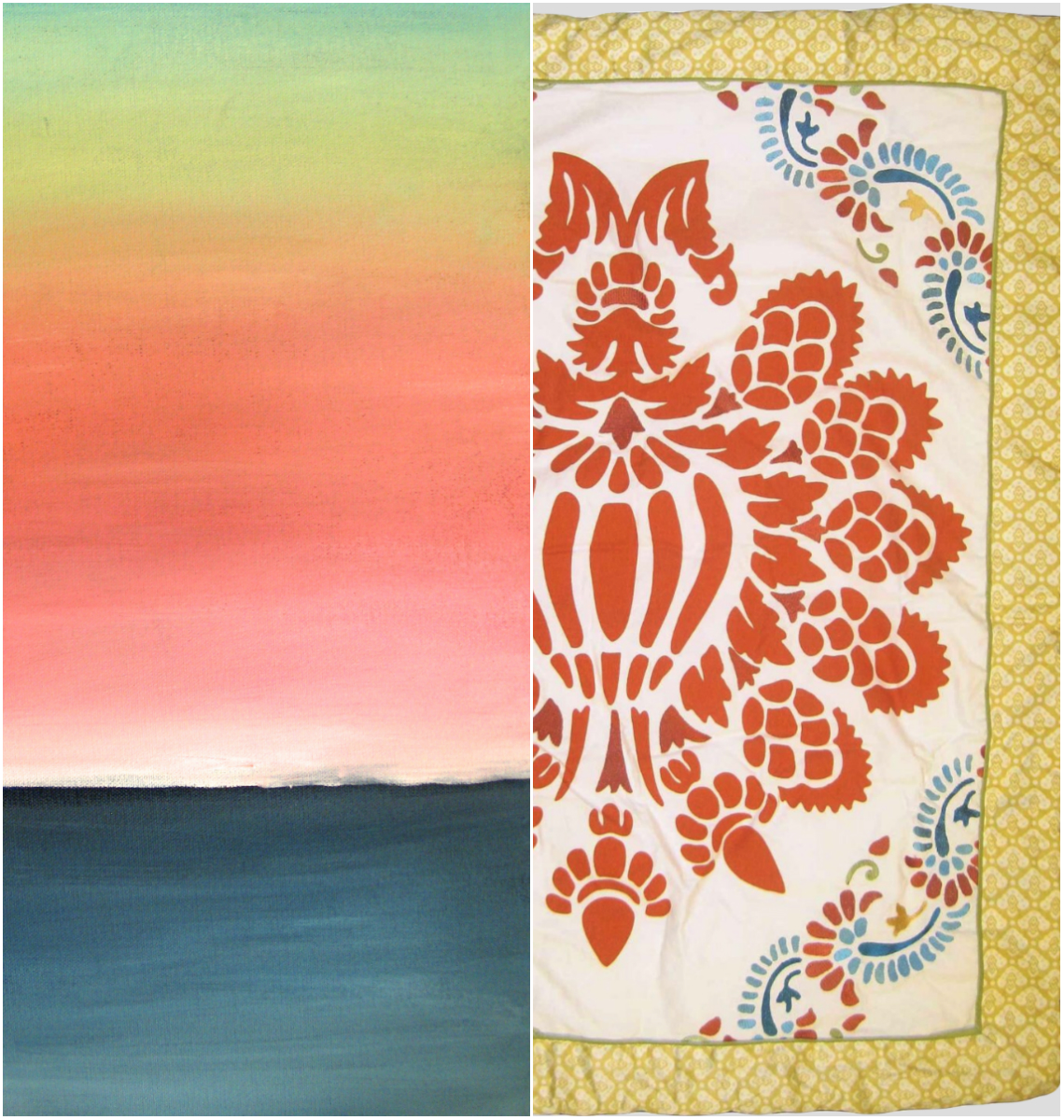
The second piece I completed recently was a little artsy gift for a few of our Idaho friends expecting their first baby soon. We could have bought something off the registry, but with our limited travel space, I’m embracing any excuse to paint on a larger canvas and then give it away! Our friends are outdoorsy like us, but not super modern, so I didn’t want to go too crazy-abstract for their soon to be daughter. The image on the right is from the bedding they selected for the baby’s room, so I wanted to create something that would compliment the color scheme without trying to recreate that motif.
The finished painting is 12×24 and I think it will add a nice pop of color to her room and something peaceful for mommy & pop to gaze at during late night feedings. Thanks for taking this little artsy detour with me! Will have a new Feminine Wiles painting to share soon!
When I gaze at the work of February’s Featured ArtistJenny Brown, which I’ve been doing a lot this month, it makes me long for the sea. These creatures of the deep and the shallows that she creates out of vintage ephemera reminds me just how landlocked we are here in Idaho. But this Sunday, we set off for our next destination, Eureka, California!
Between the anticipation of the sea air and Jenny’s work, I’m craving something salty and briny and these Soy Citrus Scallops with Soba Noodles are sure to satisfy my longing.
Those little tentacle-y shapes show up in lots of Jenny’s work and remind me so much of noodles– which I never need an excuse to consume! This recipe takes advantage of fresh scallops and snow peas to create a perfect mix of flavors and textures. The ideal pairing. All that would make it better is a glass of wine and the smell of the salt air. Soon, Artsy. Soon!
To see more of Jenny’s work, head over to her website and devour every last delicious morsel! The piece above and others can be purchased from Enormous Tiny Art and seen in person at the ETA show at Nahcotta in Portsmouth, NH.
As artists and as people, we are so influenced by our surroundings. Northwest friends will tell you that SAD is real and can hit hard during a Northwest winter! As Mr. Forager & I travel, we find it so interesting the way each different place effects us. In her work, Woodstock artist Jenny Nelson expresses her own reaction to her surroundings.
Instead of abstractions where the landscape might still be detected, Nelson’s paintings feel more like a reaction to the energy and activity in a certain place, at a certain moment. Each one is filled with layer upon layer of paint and brushstroke, as if the push to record the scene came at the artist fast and furious. I do wonder, if we were to try to record the “feel” of each situation in which we find ourselves, rather than the actuality of the moment, how different might our memories be?
Here goes, ya’ll, I’m ready to share the second painting in my new series, Feminine Wiles( see the first one here ). This new series of paintings are abstract color studies based on the fashion of iconic female film roles. While Faye Dunaway as Bonnie Parker in Bonnie & Clyde may not have been the most glamorous of wardrobes, it definitely conveys a sense of the time and of the character.
Dunaway’s earthy neutral wardrobe palette fit well with her role as a woman taking on a life usually the domain of men. Yet Bonnie’s fashions still maintain a sense of femininity and aren’t entirely cold– a bit of warmth showing through the callous exterior.
Faye Dunaway as Bonnie Parker, acrylic on panel, 6×6
What do you think, Artsies? This series is making me so uber aware of the way color is used in film wardrobe design. And it is an excellent excuse to stream some classic films!
Source for Dunaway image linked above. Artwork by Lesley Frenz.
One of the things I love best about abstract painting is its ambiguity. Without the direction of an artist statement of some sort, the viewer can have no idea the artist’s source of catalyst, inspiration or proclamation. These paintings by artist Anne Sherwood Pundyk originate from a string of images and moments in the artist’s mind.
There is an incredible amount of depth and energy to each piece, almost as if the artist can’t get that string of images out of her mind and onto the canvas fast enough. But then each has a moment of rest, like a still frame shot of the motion picture moving from mind to canvas. While each piece stems from specific imagery in the artist’s imagination, the ambiguity of the abstraction means its interpretation is left entirely to the viewer. What you see is what you see.
If you’re following along on Instagram, you might have noticed a little sneak peek into something I’ve been working on lately. Since starting my #colorforaging2014 project at the beginning of the year, I’ve had more creative energy than ever. And I’ve begun taking full advantage of it. I’ve always worked in a series format ( thanks, Prof. Ladnier for creating that habit! ) and have already completed 5(!) paintings in one series while my mind is pondering, researching, contemplating the beginnings of seven more different series of work.
Early on, my above mentioned college painting prof labeled me a colorist. It’s true, I’ve always been drawn to color and color theory. I’m sure one of my first experiences with color was in admiring the fashion in my favorite curl-up-on-a-Sunday classic films. As a little girl, I imagined myself in those beautiful clothes, becoming those charismatic leading ladies. Then as a grown woman, I’ve found myself analyzing the use of color in the establishment of character– the reasoning why the film’s costume director chose that particular gown in that particular shade for that particular scene. There was a method to all that beautiful madness.
Each series of paintings I have in mind will deal with the psychology and effect of color in some way. For this first series, which I’ve tentatively titled Feminine Wiles, I’m focusing on the fashion of iconic female film characters, especially those used in scenes in which the character is capitalizing on her feminity in some way.
Each piece is a small abstract portrait of that character at the moment and how the character is defined by that particular costume choice. All that intellectual stuff plus I just love pretty dresses and pretty paint..
The first painting in the series is a study of Audrey Hepburn’s Holly Golightly from Breakfast at Tiffany’s. While the character’s series of elegant little black dresses is synonymous with the character, I’ve always been drawn to the pink Givenchy cocktail dress. The character wears this confection while in the midst of wooing her Brazilian millionaire would-be fiancé. She is no longer fashioned as cool and elegant, her style for Jose is warm and feminine and festive. It is such an interesting contrast to the devastation that happens later in the scene.
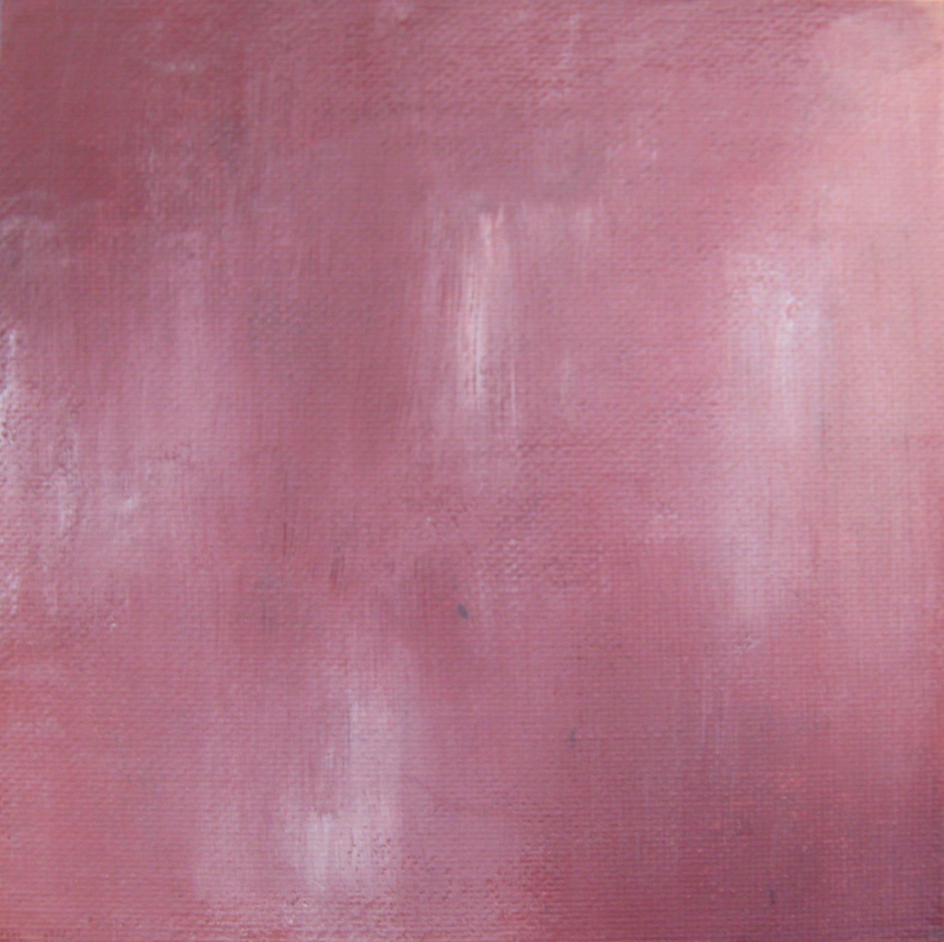
Through a sequence of layers in shades of grey, red, purple, pink and white in acrylic on a 6×6 inch canvas panel, I finally came to a point where I felt like I had a representation of my own interpretation of the character in that dress, in that scene.
Audrey Hepburn as Holly Golightly, The Pink Dress by Lesley Frenz
acrylic on canvas panel, 6×6
I’ve always worked on larger canvases in the past but our current vagabond lifestyle doesn’t include much room for storage of bulky canvases. I would love to translate these BIG, but for now, these little studies are proving satisfying. I can’t wait to share more of the Feminine Wiles series with you! Do you have any iconic female film characters to suggest? I have a list of possibilities, but am completely open to suggestion. I’ve been focusing on classic films, but may eventually move into contemporary characters, too. Can you tell I’m having a ball and completely obsessed with this? I hope so, because I totally am!
Art and logo by Lesley Frenz/Artsy Forager, other image sources linked above.
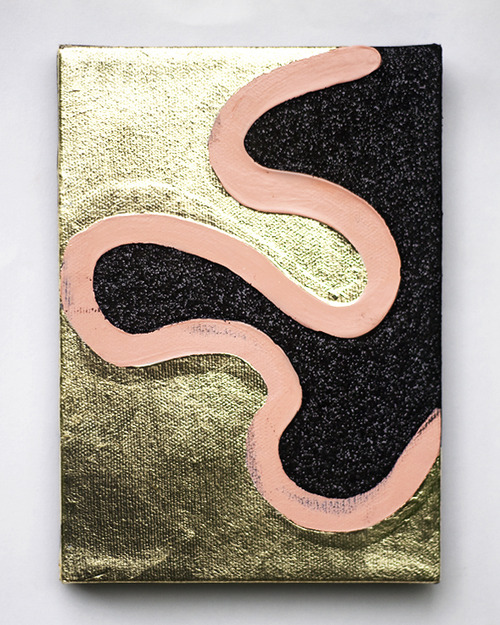
For some artists, the end product is the goal, but for others, the process of creating, pushing the limits of medium and where that journey takes them is more the target. In his work, Portland artist Justyn Hegreberg explores the reaction of paint against glitter, plastic against canvas.
Given their diminutive size, most being around 5×7 inches, there is a playfulness about these pieces that make them seem like small and lively test samples for a larger project. Which is a huge part of their charm. If they were to be enlarged, these pieces would lose some of their frivolity, gaining in return something labored. It’s that experimental aspect of each piece that is so pleasing– you can almost see him working out the juxtapositions.. so what if I extend the raw canvas here, how about some yellow there?
How about you, Artsies? Are you a final result type of artist or is the process where your joy is found? If you’d like to see more of Justyn Hegreberg‘s work, please check out his website.