Category: Abstract Art

  • Wear the Artsy: Wendy McWilliams

    Wear the Artsy: Wendy McWilliams

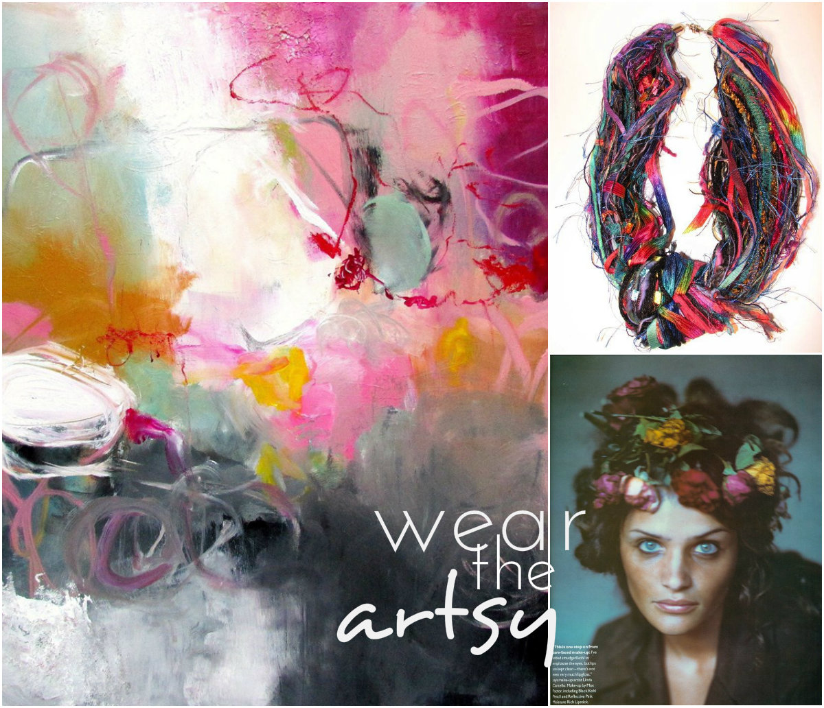
    A while back I wrote about the work of Wendy McWilliams and how to me, much of her work illustrates the glimpses of light and color that give us hope in the dark.  We are now well into winter and if you happen to be living in the Northeast, you may be wondering if you will ever see blue skies, flowers and unfrozen ground.  February has always seemed to be winter’s last cold blow, preparing us for March and the beginning of our transition into spring.  But maybe you can’t wait for March and need to put a little spring into your dark winter days!  This painting by McWilliams reminded me that even in the midst of the coldest, darkest winter, we can still embrace the spring in our souls.

    WtA_McWilliams_collage

    the art | find more like it here

    the necklace | find it here

    the inspiration | found here 

    I love how the Tapestry Necklace brings together the dark and light of McWilliams’ painting, the colors echoing the painting and the inspiration, as well as mimicking the beautiful messiness of the brushstrokes.  Perfect for a shot of color and would keep your neck warm while it’s still freezing outside!

    To see more of Wendy McWilliams’ work, please visit her website and to see more fiber art necklaces like these ( I want one!  So many gorgeous choices! ) check out the You Made That shop on Etsy.

    Image sources linked above.
  • Embracing Intuition: Vince Contarino

    Embracing Intuition: Vince Contarino

    A blank canvas can be a scary, intimidating thing.  Many artists have some kind of end product in mind when they make that first mark.  But for me, it is the ones who embrace what is happening spontaneously and throughout the painting process that create the most interesting work.  For Brooklyn artist Vince Contarino, the practice is one of careful balance between the plan and the process.

    Halcyon by Vince Contarino Old Black by Vince Contarino Fertile Green by Vince Contarino Organ Donor by Vince Contarino NT/NF/11 by Vince Contarino

    According to his artist statement, Contarino develops ideas for paintings through small graphite drawings.  Once a painting begins, it is a “continual balancing act between embracing the intuitive nature of the painting process and making aesthetic choices through patient, considered moves.”

    I’ve been learning this lesson in my own painting practice recently, perhaps starting with an idea, sketch or palette in mind, but allowing myself to follow the brush where it leads, even if that means something completely different from where I began.  The times I’ve allowed myself to do that– still learning not to force myself to conform to a preconceived ideal– are the works I’ve been most proud of.  I think Mr. Contarino is definitely on to something!

    To see more of Vince Contarino‘s work, please visit his website.

    All images are via the artist’s website.

  • Shifting Shapes: Don Voisine

    Shifting Shapes: Don Voisine

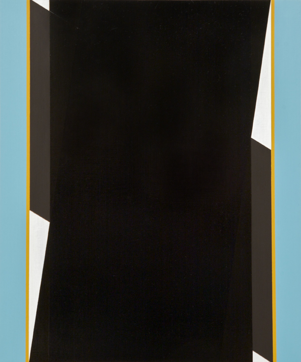
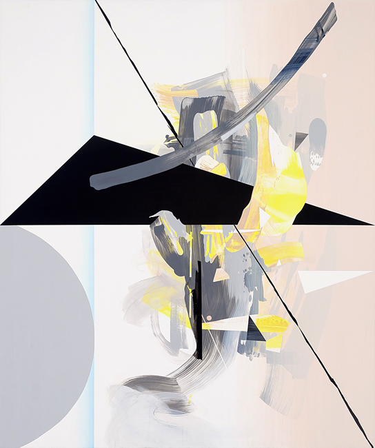
    All the world can be boiled down to the simplest shapes and forms.  Our eyes tend to focus on details, yet when we really look, we can see the world as a system of circles, triangles, and rectangles.  Brooklyn artist Don Voisine focuses on the relationship of shape, the forms that exist and the various ways our eyes will perceive them.

    Your Idea by Don Voisine Tumble by Don Voisine Ava by Don Voisine Seque by Don Voisine Flexor by Don Voisine

    Using a limited palette and flat color, Voisine’s shapes seem to shift, moving forward and back within each panel’s picture plane.  You can never be quite sure which shapes are in the foreground and which in the background, so that even with the relative simplicity of form, there are complex perspectives happening.  And with their tightly cropped composition, we’re left wondering what happens to each line and color once it leaves the confines of the panel.

    To see more of Don Voisine‘s work, please visit his website.  If you happen to be in the New Haven, CT area, a solo show of his work can be seen through March 1st at the Fred Giampietro Gallery.  Don’t miss it if you’re in the area!

    All images via the artist’s website.

  • Moving Paint: Francesc Ruiz Abad

    Moving Paint: Francesc Ruiz Abad

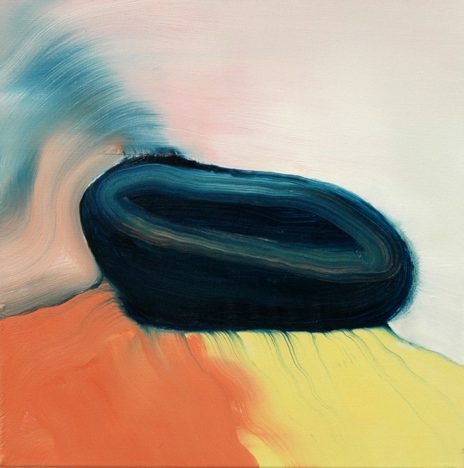
    Artists, let me ask you a question.  When you paint, do you find yourself mesmerized by the way the paint is moving across the canvas?  Not in an I’m a painting genius kind of way, but in an omigod paint is the most beautiful, wonderful thing ever, way?  Just me, then?  Ooookay.  Seriously, it is the gorgeous movement and blending of paint that draws me to the work of artist Francesc Ruiz Abad.

    Francesc Ruiz Abad Francesc Ruiz Abad Francesc Ruiz Abad Francesc Ruiz Abad Francesc Ruiz Abad

    You can see the gentle stroke of the brush, imagine it filled with paint, the colors mixing on the palette first and then the canvas.  Light, luscious, cotton candy like movement through the surface of the paint.  Colors bleed beautifully into each other, creating a sense of light and softness.

    Paintings like these make me want to paint!  And run my fingers over each canvas.

    To see more of Francesc Ruiz Abad‘s work, please visit his website and Tumblr.

    All images via the artist’s Tumblr.

  • Surfaced Memories: Jane Hambleton

    Surfaced Memories: Jane Hambleton

    Thumbing through an old photo album.  Spending an afternoon sifting through the contents of a cedar chest.  These are things I took for granted before we started traveling.  I’m even a bit envious of friends posting childhood photos of themselves all over Instagram for “throwback Thursdays”.  All of my nostalgic ephemera is tucked away in a storage unit in Seattle.  So I couldn’t help gushing over the work of Berkley artist Jane Hambleton whose mixed media pieces layer together glimpses of time into collected memories.

    Fragment III by Jane Hambleton | artsy forager #art #mixedmedia

    Hambleton_Fragment II

    Fragment Installation by Jane Hambleton | artsy forager #art #mixedmedia Memoria XIV by Jane Hambleton | artsy forager Write It Down by Jane Hambleton | artsy forager #art #mixedmedia Patterns in Place II by Jane Hambleton Color Dive by Jane Hambleton

    Beautifully textured, these created fragments seem torn from life’s scrapbook.  Sweet, momentary glimpses into a day, a summer, a moment that may have long been forgotten.  Each piece is lovely on its own, but when put together into installations, as the artist intends for each series, we see not only black and white memories, but blank canvases of color.  Perhaps these are the times that aren’t specifically remembered, yet in our minds they are still colored with feeling.

    To see more work by Jane Hambleton, please visit her website or the website of her representing gallery, Seager Gray Gallery.

    All images via the artist’s or gallery’s website.

  • Paper, Scissors, Color: Courtney Price

    Paper, Scissors, Color: Courtney Price

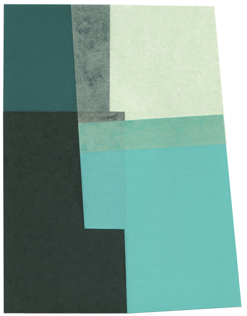
    There is a school of thought that in order for something to be good, it has to be complicated.  A special meal must mean slaving for hours in the kitchen, the latest tech gadget must be filled with buttons and apps of every variety.  But there is also beauty and tranquility to be found in the paring down.  Portland artist Courtney Price distills her paper collages into the most elementary of forms, yet the results are filled with dimension and sophistication.

    Courtney Price Courtney Price Courtney Price Courtney Price Courtney Price

    Overlapping paper shapes one on top of the other just so, Price is mixing color with light and shadow, creating varying shades just as she might with paint.  The forms advance and recede according to their hues and how our eyes perceive their shapes.  And oh, those palettes!  Each piece seems to be a study in color relations.

    To see more of Courtney Price‘s work, please visit her website.

    All images are via the artist’s website.

  • Vulnerable Abandon: Heather Chontos

    Vulnerable Abandon: Heather Chontos

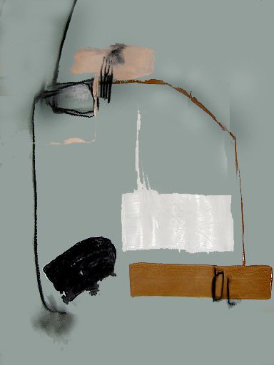
    I’ve been reading up on the Abstract Expressionists lately and have found myself completely enraptured by the movement and the entire era.  Working intuitively, many abstract artists set out without a clue as to where their composition will ultimately end up.  The work is an extension of who they are in that moment in time– a big part of what fascinates me about abstract work and abstract expressionism.  In the work of Heather Chontos, I see much of that same intuitiveness and freedom.

    Heather Chontos Heather Chontos Heather Chontos Heather Chontos Heather Chontos

    Heather made a name for herself in the world of fashion publications, styling and set designing for the likes of Barneys & Anthropologie.  And in these abstract works, there carries over that sense of composition, you can almost see her rearranging her shapes and lines on each canvas, much in the same way she might stage & style for a shoot– moving things around until it feels just right.  She isn’t afraid to let us in on that process, too.  Smudges in charcoal and paint let us know where perhaps she switched out one shape or line for another.

    Of course, there is beauty in the slick and perfectly painted canvas– but often being able to let go of our need for perfection and allow ourselves to be vulnerable as artists is a deeper challenge.  It is an act of truly putting yourself out there, there is no hiding, you are laid out on canvas for all the world to see.  Completely scary, for sure, but amazingly liberating, too.

    One of my own resolutions  goals for 2014 is to get serious about painting again.  I’ll be starting a little daily exercise over on Instagram ( come follow along! ) and will share more on that later this week.  It’s a daunting prospect, especially as I hope to be busy with freelance work too, this year, but my heart is longing for it.  Artists like Heather are reminding me that the work isn’t always about the result but about learning from the process.

    To see more of Heather Chontos’ work, please visit her website, and follow her on Facebook & Instagram.  You can purchase her work through the Milk Farm Road shop.

    All images are via the artist’s website.

  • Artsy Holiday: Casey Matthews

    Artsy Holiday: Casey Matthews

    Mr. Forager & I have been going back and forth about what type of meals we’ll have on Christmas Day.  It’s just the two of us and while that’s never stopped us from making elaborate meals before, we’re thinking a sweet little brunch and then a bit of antipasto later.  But no matter how simple the holiday meal, it always feels more festive when the table is set in an artful way!  So if you’re like me and still figuring out your holiday tablescape, here’s a little inspiration from this month’s Featured Artist Casey Matthews

    Artsy holiday Casey Matthews

    found via art | ornaments | trees | float | votives | placemat | tableware | napkins | paperweight | glasses

    I mean, those greens are just calling out holiday cheer like nobody’s business!  Add in a judicious dollop of snowy white, rich jewel tones and glittery metallics and you’ll have a table scape perfect for celebrating the season.  Casey’s painting Sitting Pretty at The End of the World is full of delicious shape and color, a Casey inspired table can’t help but sit pretty, too!

    If you’d like to see more artsy holiday inspiration, please take a peek at my Artsy Holiday Pinterest board, where I’ve been gathering all sorts of inspiring holiday images, DIYs and just plain prettiness.  To see more of Casey Matthews‘ work, please visit her website.

    All image sources linked above.  Artwork is a cropped detail of the original.

  • Unfettered Sensibility: Corey Mason

    Unfettered Sensibility: Corey Mason

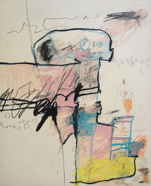
    I have a firm belief that if you are a creative person, your artistic sensibility needs multiple outlets, it fairly oozes out of you not only in the form of art, but maybe in the way you prepare a meal, decorate a home, write a letter or design a garden.  Landscape designer and artist Corey Mason of Clyde Oak extends the creativity he lavishes on his outdoor designs into his wonderfully unaffected mixed media abstract work.

    Salem II by Corey Mason Voyager Queen by Corey Mason Caballos by Corey Mason Old Man Holds Tight to the Pole by Corey Mason Untitled by Corey Mason

    Mason’s work has that kind of loose, scribbly feel that I personally struggle so hard to let into my own work.  Each piece is so perfectly imperfect.  From the smudges on the page to the backwards text so reminiscent of a child’s handwriting.  And did you spot the chicken?!  We are becoming acquainted with our landlords’ chickens.  I’m learning to delight in them so much!

    Back to Mason’s artwork– truly in looking at these I see that unfettered, naive sensibility that I think so many artists are striving for but that perhaps has been educated out of us.  I don’t know whether Corey is a trained or self taught artist, but either way, he is drawing with the carefree spirit of a child, an aim even Picasso strove to reach.

    To see more of Corey Mason‘s work, please visit his art page on the Clyde Oak website.

    All images via the Clyde Oak website.  Artist found via The Fresh Exchange.

  • Artsy Lately: Christina Foard

    Artsy Lately: Christina Foard

    I know I should be unbiased and objective.  But art is subjective ya’ll and I have my faves.  And this artist, dear Artsies, is one of them.  If you’ve been reading the blog for awhile, you’ve seen her work before.  If you’re new, well then I’m happy to introduce you!  Jacksonville, FL ( soon to be Athens, GA ) artist Christina Foard continues to amaze me each time she puts brush to canvas.
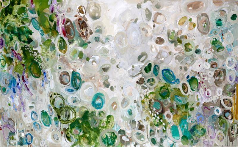
    Foard_That Sweet Night Foard_Oil Spill Garden Foard_Sliding Falls Foard_The Not So Still Life Foard_Tangled Below the Surface

    Christina creates work that is so incredibly layered with texture and color, with physical and visual depth, photos on a digital screen barely do them justice.  Not to mention size– Christina often works on a large scale, Sliding Falls, 3rd down is downright monumental at over eight feet wide.

    There is so much to see, so much to take in on each canvas, your eye almost isn’t sure where to begin.  But once you dive in, it is so wonderful to get lost in beautifully interconnecting lines and shapes.  Your eye will eventually find its way through to the lovely, light filled swaths of color, a beautiful respite among the glorious chaos.

    If you’d like to see more of Christina Foard’s latest work, please visit her website.  If you’re in North Florida, Christina will be showing work in the upcoming Our Shared Past exhibition at the Cummer Museum of Art & Gardens, opening December 17th.

    All images are via the artist’s website or Facebook page.